
Tooltips help me add extra details without cluttering a diagram. I use them when shapes or connectors need short explanations. In this guide, I explain How to activate the tooltips view in draw.io. You’ll learn how this view helps you display, review, and manage helpful tooltip information more clearly.
What Is the Tooltips View in draw.io?
A tooltip is a small information box that appears when I move the pointer over a diagram element. It can provide additional information without permanently displaying that information on the canvas.
Therefore, tooltips work well when I want to keep a diagram visually simple. For example, I can use them for technical descriptions, explanations, identifiers, or other supporting information.
The Tooltips view controls whether draw.io displays available tooltip information when I hover over diagram elements.
However, activating the view does not automatically add useful information to every shape. The element must already contain information that draw.io can display as a tooltip.
How to Activate the Tooltips View in draw.io
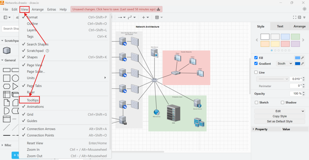
I activate tooltips directly from the main menu:
- I open the diagram in draw.io.
- I select View from the top menu.
- I click Tooltips.
- I check that a check mark appears next to Tooltips.
A check mark next to Tooltips means that the feature is active.
How to Check Whether Tooltips Work
After activating the option, I move the pointer over a shape that contains tooltip information. I do not need to click the shape.
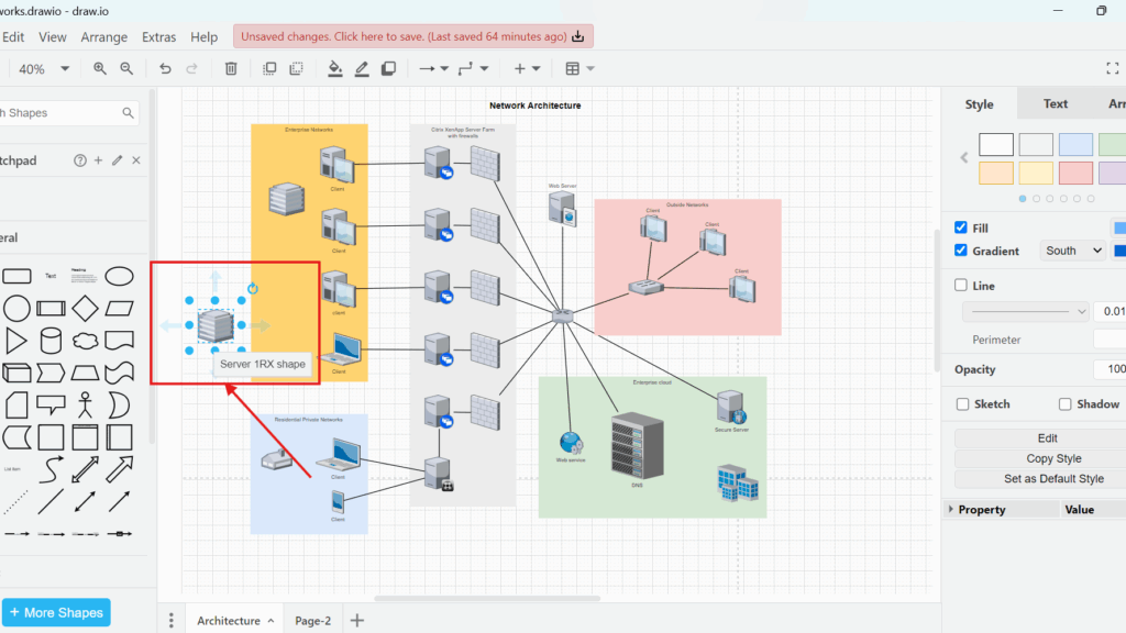
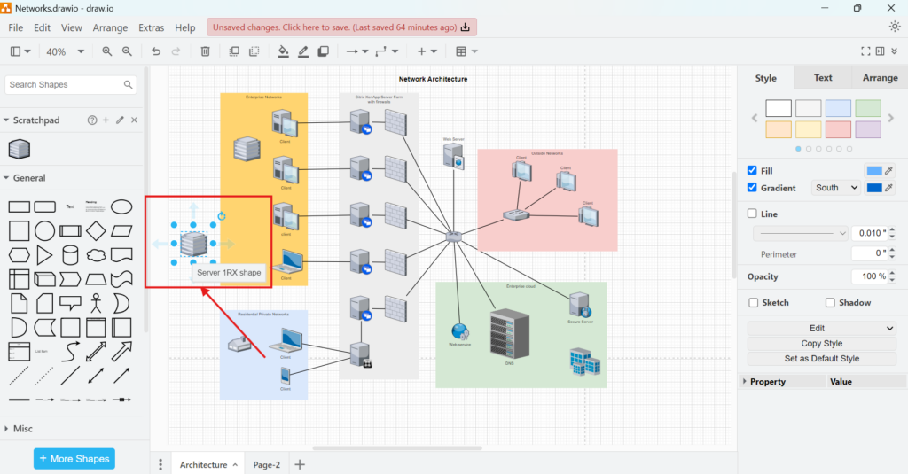
If draw.io finds information that it can display, a small tooltip appears next to the element. In the example below, hovering over the server shape displays the text “Server 1RX shape.”
If nothing appears, I first confirm that View > Tooltips remains enabled. Next, I check whether the element actually contains tooltip information.
Enabling Tooltips controls the display of tooltip information; it does not create the information itself.
When Tooltips Are Useful
I use tooltips when additional information would help the reader but would make the visible diagram too crowded.
For example, they can support:
- technical descriptions of components
- identifiers or reference information
- short explanations of specialized symbols
- additional context for network or system elements
- information that only some readers need
As a result, I can separate the main visual message from secondary details.
However, I do not place essential information only in a tooltip. A reader may print the diagram, export it as an image, or view it in an environment where hovering is not practical. Therefore, important labels, relationships, and decisions should remain visible in the diagram itself.
Tooltips and Diagram Clarity
Tooltips are most effective when I treat them as supplementary information.
For example, a network diagram should still make its servers, clients, connections, and system boundaries understandable without hovering over every object. I can then use tooltips to provide additional technical context.
A good tooltip adds detail to a diagram without becoming necessary for understanding the diagram.
This distinction helps me avoid two common problems. First, I avoid filling the canvas with unnecessary text. Second, I avoid hiding information that readers need to understand the model.
Final Thoughts
The tooltips view in draw.io is a small feature, but it can improve information-rich diagrams significantly. I activate it through View > Tooltips and then hover over an element to check its available tooltip information.
Most importantly, I use tooltips selectively. They work best for secondary details that support the diagram without competing with its main visual structure. When I keep essential information visible and use tooltips for additional context, I can create diagrams that remain both clean and informative.
What’s Next?
Now that I know how to activate the tooltips view in draw.io, I can manage helpful explanations more clearly. However, clean diagrams also need precise alignment. That is where the grid view helps. In the next article, I’ll explain How to Activate the Grid View in draw.io. You’ll learn how the grid supports better placement, cleaner layouts, and more structured diagram design. Click below to continue and align your draw.io diagrams with more confidence.
Build Better Requirements Work with the Right Tools
Requirements engineering becomes clearer when I use tools that support visual thinking, documentation, tracking, and process modeling. Therefore, I use draw.io to create diagrams, Confluence to organize knowledge, Jira to manage requirements-related work, and Camunda to model business processes. Each tool helps me reduce complexity in a practical way. As a result, I can connect ideas, decisions, tasks, and workflows more effectively. In the main article on Requirements Engineering Tools, I show how these tools work together and help me create a stronger requirements engineering workflow.